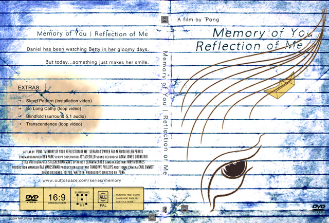
Finally, I have done DVD artwork and the label looks great in print. The front cover is not change much for the sketch. The lines are inspired by classic Thai drawing (I have to do something with at least one Thai influence). It is easy enough to crate in Illustrator even though it is not my ground of expertise. The background is the photography I took to animate in DVD Extras menu and played around in Photoshop.
The greatest thing I learn is what standard information they put on the cover and label: DVD logo, surround sound, DVD region and so on. The only thing I skipped is the rating since it is not classified even though there is a little bit of nudity.
Mixing surround sound design is a very interesting process. I will share it later. Next stop is the last stop�getting ready for the final presentation.
21 October 2009

